My Favourite Themes
Why struggle with inventing UI colors when you can use established ones? Here are my favourite themes that I use daily.
I see a lot of people struggling with inventing UI stuff, especially the colors, when they can use already well-established ones. There's no need to reinvent the wheel when masterfully crafted palettes already exist. That's why I wanted to share my personal favourites that I’ve used throughout my journey.
1. Dracula
Dracula was the first theme I truly committed to. It’s legendary for a reason—the deep purple background and vibrant neon accents make code pop without being distracting. It’s a classic that works on almost every app imaginable.
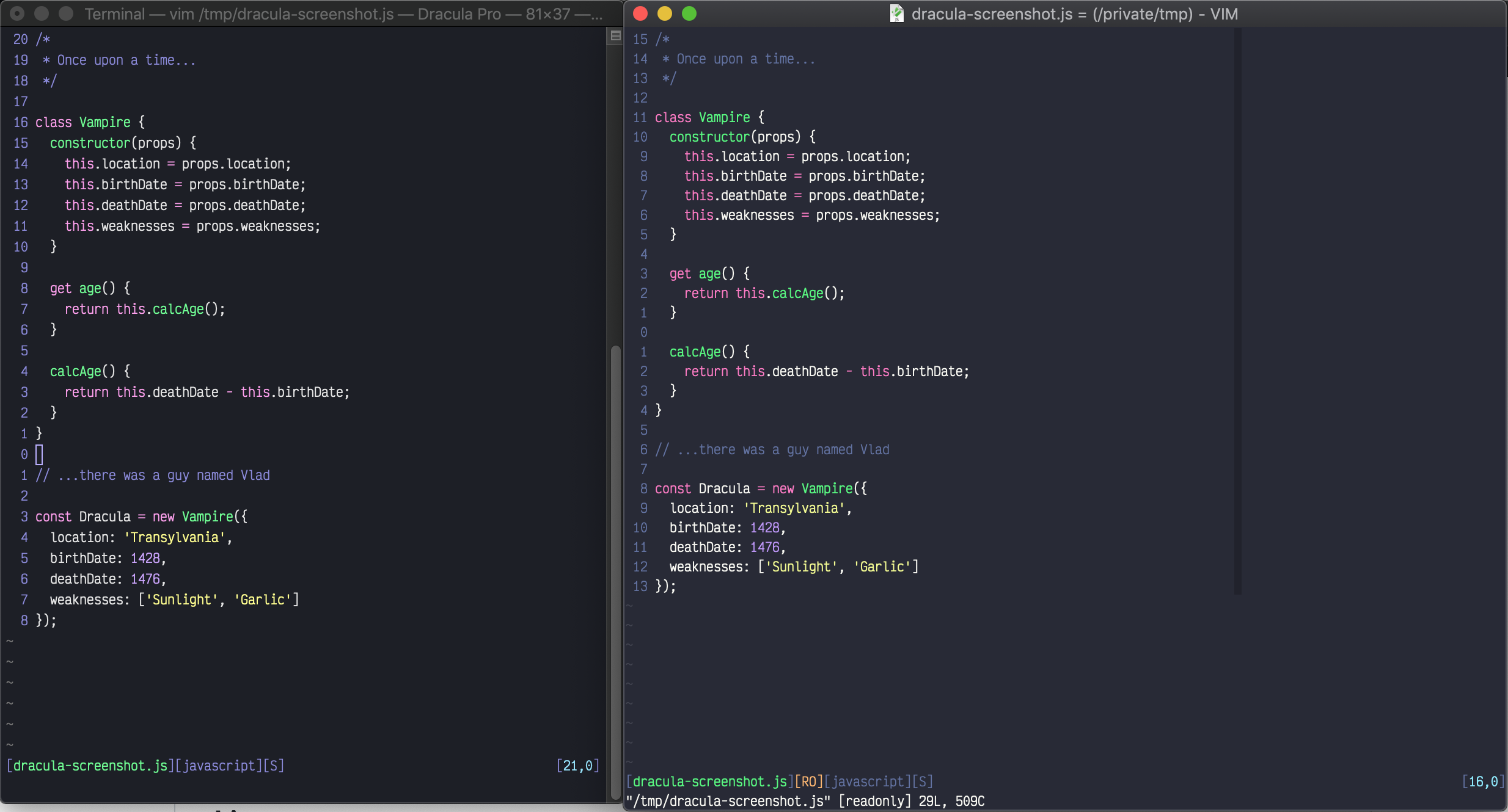 Source: Dracula Vim Official Repo
2. Catppuccin Macchiato
After my Dracula phase, I moved to Catppuccin. Specifically, I fell in love with the Macchiato flavor. It’s a bit softer than Dracula, with a beautiful pastel palette that feels incredibly modern and easy on the eyes during long coding sessions.
 Source: Catppuccin
3. Rosé Pine
Lately, I've been experimenting with Rosé Pine. It has a unique "ethereal" feel with its blend of dusky pinks and deep blues. It's sophisticated and minimal, perfect for when I want a cleaner, more refined workspace.
 Source: Rosé Pine
If you're struggling to find the right colors for your next project or your IDE, I highly recommend starting with one of these. They are battle-tested and beloved by the community for a reason!